FT4Web by Investors FastTrack

Learning about FT4Web | Blog | FLOSS | Who is FT?

Trading Sector Mutual Funds using
the FT4Web Momentum Model

Updated 04/08/14

This article discusses Momentum modeling among many sector funds. Momentum's dynamic allocation trading will often produce more return, with less risk, when compared to static allocations.

There is another interesting short article that compares dynamic to static allocation which describes an effective simpler strategy than what is discussed in this article.

There is a related article which deals with Managing Money using the FTAlpha Momentum modeling.

Fidelity and ETFs- YES
Comparison Sector Funds

The first question is,

"Which group of sector funds should I trade?"!

The Fidelity "Selects" well known, well-managed sector funds. FastTrack users have long been holders of Fidelity funds.

  • Fidelity has consistently and actively managed funds with reasonable quality, diversity, cost, and trading limitations.
  • These funds have a lot of history for backtesting.
  • Fidelity rarely discontinues funds for poor performance, reducing survivor bias (Backtesting looks great when all the dog funds have been discontinued)

On October 2003, Fidelity eliminated the 3% front-end load for its SELECT sector funds to better compete with Exchange Traded Funds and other sector funds. This opened a broader range of sector trading opportunities. The remainder of this article discusses the trading of the Selects. However, the same principles apply to all funds.

Improving on the Selects

The Selects are notably missing international funds, bond funds, and Realty funds. Here are some good potential funds to include:

  • VUSTX/TLT, US long Bonds
  • CSRSX/ICF, realty funds
  • EEM/FEMKX, emerging markets
  • FLPSX, low priced stock
  • FFXSX/TUZ,or SHY, VGSH, BSV Short Bonds

The listed open-end funds above have many years of history. The ETFS are highly correlated to those  open-end funds. Use the long history funds for proof of concept, but trade the ETFs.

The easy way to start back testing sector funds
  1. Right-click in the center of the chart
  2. Choose Load.
  3. Choose Charts.
  4. Choose Tradable_Sector_Funds.CDF
  5. Click the word TotReturn label in the upper left to display the Chart Label
What You See is ...

Chart 1:

Chart 1's Select AVG, red line, above is a monthly, equal assets, rebalanced average of all the Selects (including money market). Note,

  • Combining all these US sector funds into a single line produced a red line highly correlated to the S&P 500 (the green line).
  • A Red Cor= over 90% indicates that the red and green lines almost always move in the same direction.
  • The Red and Green SD= values measure volatility. In this case the red line is slightly less volatile than the green line . . . a clear case of more return with less risk.

The message to the investor is that Fidelity Selects are well-managed, provide good risk-adjusted return, and are built on 500 stocks of S&P.

Note: This AVG includes FNINX and FSPFX which were discontinued on 6/17/2009. This avoids survivor bias caused by removing these dogs. In fact, the annualized return between 6/17/2009-1/10/2011 did improve by 5.1% annually (not shown).

The Momentum Model

Sell the losers. Let the Winners ride.

Chart 2's terrific Select AVG red line is created by selling the lowest ranking Select funds at the end of each month, and then buying the highest ranking funds on the first of the month . This differs from Chart 1 which simply held all funds in an equal amount rebalanced monthly.

Chart 2's model only sells 25% of assets each month, and reinvests in the top 10% (by count of funds in the family). This example was ranked by return (gain/loss n the last calendar month)

When you compute an AVG line, you can see  what trading took place. Start your favorite text editor like Notepad. Open the file named:

C:\FT\FT4WIN\TEMP\REBALANCE.LOG

The following is an abbreviated list of trades that were performed to generate Chart 1's red line.

Chart 2:

Starting with Chart 1 displayed as discussed above.

  1. Right-click in the center of the chart and select Appearance.
  2. In the second column. Select Rank by Return.
  3. Click the Draw Chart button.
  4. Right-Click on the red ColorBar cell and select "Recompute AVG"
Chart 2's Reblance.LOG

A Rebalance.log file is created each time you compute an AVG line. It shows the trading that produced Chart 2's red line.

Rebalance.Log's top line shows that starting at 9/1/88, $100,000 in assets was divided equally among the 30 Select funds which existed at that time. These is no magic in this starting strategy. We will discuss how real people start using the model further down. At the end of the month, 9/30/88, the model sells all or part of the worst funds until $26,025.14 of assets are in cash (25% of the end of month assets). The term "investable" refers to issues which existed and had assets.

These assets are then placed in equal dollar amounts into the top 10%, by count, of funds. Top funds are those which had the highest return during September 1988.

In the beginning . . .

SELECT Monthly Momentum by Return Rebalance Log on 01-10-2011 at 17:55:00
09/01/1988 Divided $100,000.00 between 30 issues, each getting $3,333.33
09/01/1988 All Asset Total= $99,999.999
09/30/1988 Sold: $ 3,209.42 of FSESX
09/30/1988 Sold: $ 3,218.76 of FSAGX
09/30/1988 Sold: $ 3,319.79 of FSENX
09/30/1988 Sold: $ 3,338.44 of FSDPX
09/30/1988 Sold: $ 3,344.63 of FSPFX
09/30/1988 Sold: $ 3,393.73 of FSAVX
09/30/1988 Sold: $ 3,415.70 of FSCHX
09/30/1988 Sold: $ 2,784.66 of FSCGX
09/30/1988 Total Sold $26,025.14 of bottom 8 investable issues
09/30/1988 Bought: $8,675.05 of FSCSX which now has $ 12,302.35
09/30/1988 Bought: $8,675.05 of FDLSX which now has $ 12,272.74
09/30/1988 Bought: $8,675.05 of FSHCX which now has $ 12,261.54
09/30/1988 All Asset Total= $104,100.563


....monthly trading continues

Scrolling to the bottom of Rebalance.log, you see the final positions on  the last day of the database, a 2370% gain since 1988 using a simple, not optimized strategy.

There are an unusually large number of holdings  (13) at the end. This occurs in prolonged uneven trendless markets. Usually, the strategy holds 5-6 funds at a time.

As of the end of 2010, the final holdings funds were in three sectors: Energy, Financial Services, and Technology. Two or more funds in each sector were held. There was no human decision made in this allocation, the FT4Web Model did it all.

In the End

...
12/31/2010 Total Sold $756,245.44 of bottom 4 investable issues
12/31/2010 Bought: $151,249.09 of FSRBX which now has $ 151,249.09
12/31/2010 Bought: $151,249.09 of FIDSX which now has $ 151,249.09
12/31/2010 Bought: $151,249.09 of FSHOX which now has $ 151,249.09
12/31/2010 Bought: $151,249.09 of FSLBX which now has $ 151,249.09
12/31/2010 Bought: $151,249.09 of FNARX which now has $ 306,731.80
12/31/2010 All Asset Total= $3,024,981.858
Final Positions on 01/04/2011
FSESX $ 485,313.34 Fidelity Sel Energy Service/43
FSAVX $ 335,279.81 Fidelity Sel Automotive/502
FSDPX $ 322,563.39 Fidelity Sel Materials/509
FSCHX $ 318,541.90 Fidelity Sel Chemicals/69
FSELX $ 316,225.97 Fidelity Sel Electronics/8
FNARX $ 306,291.23 Fidelity Sel Natural Resources/514
FSENX $ 154,454.58 Fidelity Sel Energy/60
FIDSX $ 154,024.07 Fidelity Sel Financial Services/66
FSLBX $ 153,988.59 Fidelity Sel Brokerage & Investment/68
FSRBX $ 152,883.33 Fidelity Sel Banking/507
FSHOX $ 149,739.20 Fidelity Sel Construction & Housing/511
FSDCX $ 102,964.68 Fidelity Sel Communication Equipment/518
FDCPX $ 60,597.89 Fidelity Sel Computers/7
FSPTX $ 24,083.41 Fidelity Sel Technology/64
FSPCX $ .00 Fidelity Sel Insurance/45
FSUTX $ .00 Fidelity Sel Utilities Growth/65
FSCSX $ .00 Fidelity Sel Software & Computers/28
. . .
Final Total assets = $2,370,382.50

The Momentum Model by Return is Flawed

We zoom into Chart 3 to look at the technology bubble of 1999. During the 95 market-day period between the poles, the Red Monthly Momentum line returned (BP=103%) doubled. The model became totally invested in the four Select HITECH funds, then suffering the losses when the bubble popped.

There are other periods where the model became entirely invested in gold and then in energy. Any strategy that becomes nondiversified risks drawdowns. Also note, the high volatility measured in the red Standard Deviation value, SD= 7.24%, in the upper left of the chart compared to the green SD=6.29.

Using Common Sense

FastTrack has many other tools for timing and analysis. Use them. Don't be afraid to deviate from the model by putting some assets into money market when bubble conditions prevail. Although your return will likely be less than the model, your volatility will also be less, and you will sleep better.

Alternate Common Sense, use FTAlpha

Instead of having the model rank by return, rank by FTAlpha

Chart 3:

To get the chart below starting from Chart 2, do the following

  1. Right-click in the center of the chart and select Appearance.
  2. In the Start Date area enter 9/19/1997.
  3. In the end Date area enter 6/16/2003
  4. Click the Draw Chart button.
  5. Plant the poles as shown if desired.

This chart below shows the years surrounding the Internet bubble.
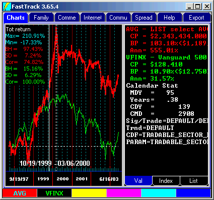
What you see is . . .

A yellow FTAlpha Monthly Momentum AVG line with excellent return (better than the red and green lines) plus resistance to drawdowns plus  a modest Standard Deviation. 

FTAlpha's Theory of Operation

FTAlpha gives top rankings to good funds which are not highly correlated to your portfolio AND which have good risk-adjusted return.

Your portfolio, in this example, is defined as the yellow line. At the end of each month. FTAlpha reviews the shape and return of the yellow line, and then ranks the other issues in the family to score how well they would have contributed to better risk-adjusted return in the past month. The highest FTAlpha scores are bought and the lowest sold.

Note that from late 1998 through most of 1999, the yellow line and the red line were similar. However, in late 1999, the yellow FTAlpha line sharply diverged for the red Return line, even to the extent of going down during the technology bubble. This happened because the portfolio became so heavily weighted toward technology in 1999, that FTAlpha began to low rank technology funds. The model dutifully diversified, choosing nontechnology sectors.

When the bubble hit, the yellow FTAlpha line did quite well even in the teeth of the bear market.

Chart 4

To get the chart below starting from Chart 3, do the following

  1. Right-click in the center of the chart and select Appearance.
  2. In the second column. Select Rank by FTAlpha.
  3. Click the Draw Chart button.
  4. With the mouse in the center of the chart, hit the Y key. Enter "Select AVG" in the pop up box.

The red is Momentum by Return. The yellow is the Momentum by FTAlpha.

Differences between Model by Return and FTAlpha

The chart tells the story. The Yellow FTAlpha ranking of the Selects has a MUCH better risk-adjusted return over almost any period you measure. However, it has about the same return as the Momentum by Return red line.

From the market top on 10/09/2007 - the market bottom in 3/09/2009. FTAlpha lost -31% . . . far less that the near -43% lost in both the S&P-500 and the Momentum Return ranking. It would have been nice if the FTAlpha model had switched to funds that were not losing money during the period, but ALL 41 Selects lost -24 to -80% for the period . . . except for Select Money Market. However, since money market funds have infinitely high risk adjusted return (any positive return divided by zero risk), they are ignored by FTAlpha.

Bottom Line

You are unlikely to follow a strategy (like the red Momentum by Return Line) that takes steep drawdowns. Momentum by FTAlpha is MUCH easier to follow than the Momentum by Return Strategy.

To get the chart below starting from Chart 4, do the following

  1. Right-click in the center of the chart and select Period displayed.
  2. Select "All".

Disclaimer

The FT4Web Modeling capability is a proof of concept. However, there is no guarantee that you will make money.

NEVER follow a model's suggestions to hold a highly nondiversified portfolio.

Consult your regular sources of investment advice. If you do not understand the investment objectives of a fund and trust it's management, then don't invest in it.

Avoid highly volatile funds.

What do I do today.

To find out what you should trade today, do the following exercise.

  1. On the Chart Tab
  2. With the mouse in the center of the chart, hit the M key. Enter SELECT (e.g. the family for Fidelity Select Sector funds) , then click OK.
  3. With the mouse in the center of the chart, right-click and select Appearance (not shown to the right).
  4. Change the "Rank by" to "FTAlpha (not shown to the right).
  5. Click the Draw Chart button.
  6. Right-click the white "Tot Return" chart label in the upper left as shown. (see chart to the right)
  7. Select Parameters.
  8. Enter VFINX in the Low field as shown.
  9. Click the Done button (not visible as shown on the right).
  10. Move the mouse to the center of the chart,
  11. Right-click, select period displayed, select 1-mouth.
  12. Hit the ² (Home key) to move the Dashed Pole to all the way to the left.
  13. Hit the £ (up-arrow key) to remove the Solid Pole (if present).
  14. Move the mouse to the center of the chart and Hit the k key. This will rank the SELECT family and Switch to the spreadsheet Tab.

     key

FTAlpha Selection

Your portfolio, in this example, is defined as VFINX, the Vanguard SP& 500 fund.

What you see is . . .

The green VFINX is the basis for the FTAlpha calculation so, by definition, it's FTAlpha is zero. In this example VFINX is serving as a proxy for your portfolio.

Buy Highlights
  1. At the top FSHCX has much better return than VFINX, modest correlation, and a low ulcer index. It will improve the return while decreasing the volatility.
  2. FSHCX (Medical Delivery) and FSLEX (Electronics) have strong returns, with very low correlation. The low correlation substantially offsets the somewhat higher volatility meriting the high FTAlpha ranking.
  3. Just above the green VFINX, FCYIX has about the same return as VFINX, modest correlation, and slightly higher Ulcer index. This performance is unremarkable. It is unlikely to have much effect on the portfolio.
Sell Highlights
  1. At the bottom, FSLXX is 999.99. Since money market Funds haveno volatility, risk/return calculation produces a meaningless figure/ FSLXX will never be bought or sold by the Model
  2. Other 999.99 values for FSPFX and FNINX occurs because they have been flat for a long time . . . in fact, they were discontinued by Fidelity. FT has left these fund histories in the database to avoid any survivor bias in the modeling of the Selects. That is, when all the dog funds are removed from the database, then the Model back test becomes meaningless.
  3. FSRBX (Banking) has double the return of the S&P, but 5 x higher volatility which seriously degrades the FTAlpha rating.
  4. FSPCX (Insurance) has a high correlation to VFINX with lower return, and more volatility, A triple whammy.
  5. FSAGX (Gold) has very low correlation, but negative return -plus high volatility. That gives it it's bottom of the stack rating.

Download a free 30-day trial. Use scientific methods to find the best of the none.

Keys: Select Momentum, Sector Momentum, Momentum Model, Fidelity Momentum, ETF trading Range, ETF Spread, Bid ask, Bid/Ask, underlying index, ETF underlying,