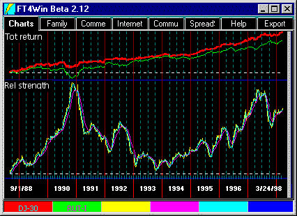
 Relative Strength Chart
The Relative Strength Chart compares the performance of the red and green lines. The yellow line is the raw relative strength line of the red line calculated as the ratio between the percent return of the red line and the percent return of the green line. When the yellow line upturns, the red line is outperforming the green line. Conversely, if the yellow line moves down, the fund is underperforming. If the yellow line is flat or horizontal, the red line and green line performance is the same.
Relative strength works well when the red and green lines are not highly correlated.
Relative Strength does not generate is own signals as does AccuTrack, an
alternate expression of relative strength.
Disclaimer: No technical indicator can assure profits. As market conditions change, the interpretation and use of the indicator must change.
The Average Lines - Blue and Purple
The Short Average line (light blue) is a short moving average of the yellow line. The Long Average line (purple) is a longer moving average of the yellow Relative Strength line. The length of the averages may be user set in the Parameters Dialog.
Yellow and Purple Values
AccuTrack's Ind= values reported in the Performance Values start at 10 and are scaled in proportion to the relative strength. There is no maximum or minimum value.
Charting an Inverse
- Load the Charts "TTTRRR".
- Use 0% for your Red Line.
- Use the fund you want to inverse as the Green Line.
- Hit the "!".
That's it. The red line is now the inverse.
 What does this
mean?
Relative Strength is best used to see the swings in sentiment between major market segments. In the illustration above, the R Chart shows the swings between large caps in red represented by the Dow Jones 30 Industrial Average (DJ-30) and small caps in green, represented by the Russell 2000 Index. The chart makes it clear that there are major turning points in large-cap/small cap sentiment. You would shift the weighting of your portfolio to small-caps as the yellow line of the R Chart falls, and shift to large-caps when the yellow line rises.